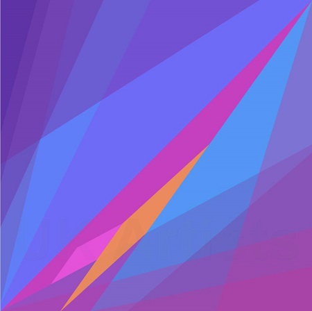
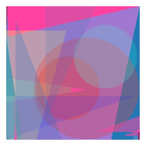
The Power of Colour10/03/2022Author: Iain Dryden
Colour, for me, is the key. I will set down the base and work on layers of interrelated hues and tones which create a mood that resonates inside me. There is no formula, just a reaction. As I work, I find excitement mounting, subtle, but definitely there when hues interact and create a charge. The ‘snake effect’, let’s call it. The mind is driven to find patterns - the rope in the long grass needs to look like a snake so that we can jump out of the way. Better than being bitten by an adder. It is that ancient instinctual reaction which is triggered when we look at a work of art and our ability to let go of thought and to allow the image to ‘take’ us, defines the quality of our experience. That ability is vital when confronted by an abstract, for there is no lexicon to tell us what we are looking at. One has to engage without preconceptions. Indeed, the abstract painter aims to reach beyond expectation to a raw awareness where judgement is suspended and experience dominates. It is a child-like envelopment, hence those who can ‘let go’, love abstract art. The specific mix of colours can be a surprise, the melding of tones soothing, or the interplay across the spectrum a challenge. As the shades shift, one pinky blue tint or a buff green against a mauve, the artist’s eye is stimulated, the brain is warmed. The artist senses what the next colour could be and tests it out, then applies this new layer of complexity. An abstract painting, in my view, cannot be described in words. It is about the resultant art, not a description of it. If an onlooker sees something in it, then that is fine, we each interpret the world around us in our own way. For the abstract artist, it is a raw experience, words, references, they don’t exist. You the painter sense a contrasting or complementary colour would create this, or perhaps that, sensation. You try it out several ways and decide to explore this, leaving that to rest for another day’s exploration. As I work, I discover that colour, and this is highly personal, is not divided into warm and cool, hot and cold. Like words, that distracts. A dull blue can be vitally warm against a stringent yellow. A vibrant pink coupled with a shy red can generate a tenderness that leaves your brain content. A splash of khaki green running across reds and pinks and browns…. Oops. No! But it works, Who knows why. I don’t care. I have left such ‘rules’ behind.
I began my new series well over a year ago to give a little shot of joy to a dying friend. It helped that I too am unwell. Playing with colour, sensing what each hue did to me, what the shape combinations and interacting colour vibrations did to my senses, was essential. I hope it gave dear P a little something. Later, wishing to help beleaguered NHS staff during the worst of the pandemic, I made posters with simple de-stressing exercises beside my work. I have been told they are indeed joyful, helpful. That is why my new series is called ‘Beyond the Blue’. Iain Dryden |
Comments